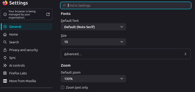
• Some of the links on this forum allow SMF, at no cost to you, to earn a small commission when you click through and make a purchase. Let me know if you have any questions about this.

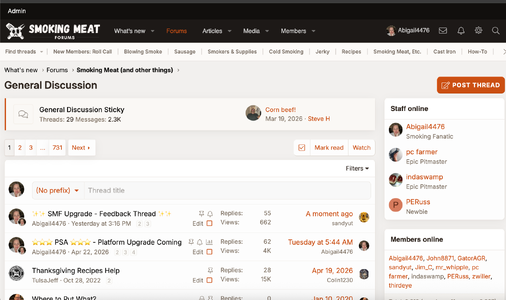
✨✨ SMF Upgrade - Feedback Thread ✨✨

SmokingMeatForums.com is reader supported and as an Amazon Associate, we may earn commissions from qualifying purchases.
Later to the show so some of the bugs have been adjusted.
Only logged on with desktop platform so far and uh um OK. I'll try it mobile in a day or so.
I've never understood the desire to rebrand (change) something that wasn't broken

Totally understand the sentiment, @Fueling Around! Technically SMF was "broken." We were logging hundreds, maybe thousands of system errors per day and the bounce rate has been sky-high since about June of 2025. So the upgrade and cleanup desperately needed to happen.

The only thing I don't like so far is the "Who read this article". I never noticed this prior if it was already in place as I rarely read articles.
I like my ability of +Lifetime Premier+ to stay hidden unless I choose to respond to a thread.

We'll definitely tweak the navigation further, removing buttons that aren't needed and putting some in that are more important.
 
I feel like I'm losing my mind, but where is the box to post a new thread? I'm sure it's right in front of my face, but for the life of me I can't find it.
 

Attachments

  • Screenshot at 2026-05-21 11-20-22.png
    Screenshot at 2026-05-21 11-20-22.png
    60.6 KB · Views: 24
I'm still getting used to the new layout, but I like the "Filters" option on the what's new page.


Thanks for all you folks do.

Chris
 
My top and bottom used to be orange. Anyway to change it back?

The old bright old orange style was no longer supported and wasn't updated with the refresh.
I feel like I'm losing my mind, but where is the box to post a new thread? I'm sure it's right in front of my face, but for the life of me I can't find it.

While viewing a forum, you can use these two features. A global create button should be coming a home back soon
1779378084237.png
 
I use the site mostly for talking with some " friend " memebers and answering questions I get asked .
The icons for PM's and alerts are super small for me ( maybe a setting on my end ) , and they are so dim , they are hard to see . I had to go back to light mode just to see them .

By default, they would dim without active notifications. It's pretty clear when you have alerts so I've removed that dim. I also agree, having them a little larger is nicer. Working on that now as well.
 
For me... Read and unread color/contrast of the title is hard to diffientiate between the two in dark mode... A little better in white...

I've made a little adjustment here. Light mode was definitely easier to spot read/unread. Both dark and light use bolded titles for unread, but dark will use a slightly brighter color now for unread threads/forums. Should help.
 
First impressions, I like it.

Couple things if tweakable: brighter font on dark screen, larger font or user adjustable font would be great. Old guy vision is not so good.

When I try to add a user with @xxxx its doesnt autofill the name list like it used to? Is it me?

@Abigail4476 Thank you for all your work on our site!
 
I feel like I'm losing my mind, but where is the box to post a new thread? I'm sure it's right in front of my face, but for the life of me I can't find it.

@GatorAGR, I have light mode on right now - it's the orange button at the top right of my screen. I haven't looked at mobile, not sure if you're on a desktop or phone/other device.
 

Attachments

  • Screenshot 2026-05-21 at 11.01.44 AM.png
    Screenshot 2026-05-21 at 11.01.44 AM.png
    493.7 KB · Views: 23
The picture on the featured page for no trim plate ribs is different than the picture on the what's new page. Also, the featured page has more items listed then the featured items on the what's new page.

I am in the camp of liking the "old" carousel over the new featured items.
 
First impressions, I like it.

Couple things if tweakable: brighter font on dark screen, larger font or user adjustable font would be great. Old guy vision is not so good.

When I try to add a user with @xxxx its doesnt autofill the name list like it used to? Is it me?

@Abigail4476 Thank you for all your work on our site!

I'm able to do the tag with @ + username. 🤔
 
@GatorAGR, I have light mode on right now - it's the orange button at the top right of my screen. I haven't looked at mobile, not sure if you're on a desktop or phone/other device.
Thanks! I see that if I enter the list of forums, but not if I'm out on the main page. Anyway, I found it, but seems like it needs some tweaking.
 
SmokingMeatForums.com is reader supported and as an Amazon Associate, we may earn commissions from qualifying purchases.

Latest posts

Back
Top
Clicky